


OpenAI’s ‘Ominous’ New Logo Leaves Staffers Reportedly Stunned
The company is said to be replacing its current logo with a new design resembling a black ‘O.’


In the coming year, OpenAI could undergo major transformations, including a brand-new logo. However, when staff members got an early glimpse of this redesign during a recent company-wide meeting, their reactions were far from enthusiastic. The company’s well-known hexagonal flower emblem — made famous by ChatGPT’s rise to global prominence — will be no more. Instead, it will be replaced by a large black
“O” or a simple ring, a design that many employees reportedly found uninspiring, even foreboding.
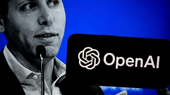
According to insiders, the proposed logo contrasts sharply with the current one, which was crafted to symbolize “precision, potential, and optimism.” The shift in branding comes after OpenAI brought in new members to its internal creative and design team about a year ago, as part of efforts to rework its visual identity. One motivation for the change, as reported by Fortune, is that OpenAI doesn’t own the typefaces used in its current logo and website. By adopting a fresh design, the company may be looking to solidify its brand as it becomes even more of a household name.
OpenAI is also preparing for a deeper structural transformation. According to previous reports, the organization plans to transition away from its nonprofit model next year. Despite starting as a nonprofit, a nonprofit entity still oversees its for-profit operations. CEO Sam Altman reportedly told employees that the company is moving towards a more conventional for-profit structure. Whether the leadership will take employee feedback into account remains to be seen, but if they do, the new OpenAI could debut with a more agreeable logo than the one that some staff currently view as ominous.
In recent months, the proposed logo has sparked shock, concern, and unease among OpenAI staff. During the meeting, employees were shown a minimalist black “O,” which some interpreted as a ring or even a zero. The stark simplicity left many employees disappointed, with some vocalizing their discontent. The new logo marks a significant departure from the existing hexagonal flower, designed by Ben Barry, which represents “precision and optimism.” Many staff members still feel a strong attachment to the current logo, which features prominently across company merchandise, from shirts to stickers.
The redesign is still a work in progress, and internal discussions suggest that the final look could shift again before it’s officially unveiled — possibly as early as next year. That year will also bring significant changes to OpenAI’s corporate structure, aligning with its increasing focus on revenue and investment. As one of the most valuable and high-profile companies in the generative AI space, OpenAI is setting the stage for a 2025 relaunch that could include both a new look and a new organizational model.
OpenAI began its rebranding efforts about a year ago when it expanded its creative and design teams, hiring talent from top agencies and fields like graphic design. A key reason for the redesign stems from the fact that OpenAI does not own the fonts used in its branding and web content — they are licensed from external type designers. The existing logo, however, was created in-house and described in a 2022 brand guide as OpenAI’s “most recognizable brand element,” reflecting its “focused ambition to create technology that benefits humanity.”
Elon Musk’s decision to rebrand Twitter as “X” offers a parallel to OpenAI’s potential logo overhaul, both symbolizing bold shifts for iconic tech companies. When Musk replaced Twitter’s signature blue bird with a stark “X” in July 2023, reactions were mixed, much like the internal response to OpenAI’s proposed black “O” logo. While Musk envisioned the change as a step toward transforming Twitter into a multi-functional platform encompassing payments, messaging, and more under the “X” brand, users and critics saw the rebrand as a departure from the platform’s established identity, leaving many unsettled and sparking criticism and ridicule.
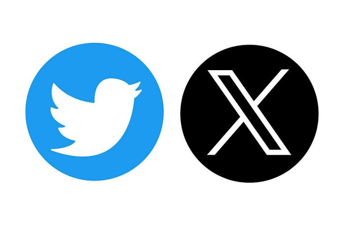
The change was swift and dramatic — Musk altered the logo and even replaced the official corporate signage at Twitter’s San Francisco headquarters almost overnight. Similar to OpenAI’s staff concerns about their new logo’s lack of creativity and ominous tone, many long-time Twitter users lamented the loss of the iconic blue bird, which had become synonymous with social media culture. The simplicity of the “X” logo, much like the minimalist “O” proposed for OpenAI, sparked debates about the value of tradition versus innovation in branding.
Musk’s rebranding of Twitter as “X” also highlighted how logo changes can symbolize broader shifts in a company’s vision. For OpenAI, the transition from a hexagonal flower to a black “O” could mark a similar leap — from its initial nonprofit ideals to a more aggressive, commercial stance. In both cases, the logos represent not just a design shift but a signal of deeper transformation within tech giants redefining their future.